Facilitator guide
Case objectives, demonstration plans, debriefs, common mistakes and application checks across all 81 workplace cases and method lessons.
Download Facilitator guide PDF · 166 pages · 65.1 MB OPEXSTUDIO
State the decision question in ordinary language.. Follow the visual, practise a decision, then check your thinking.
Fictional teaching examples and AI-generated illustrations. Proposed changes and goals are not achieved results. Use the written instructions and check local conditions before applying a method.
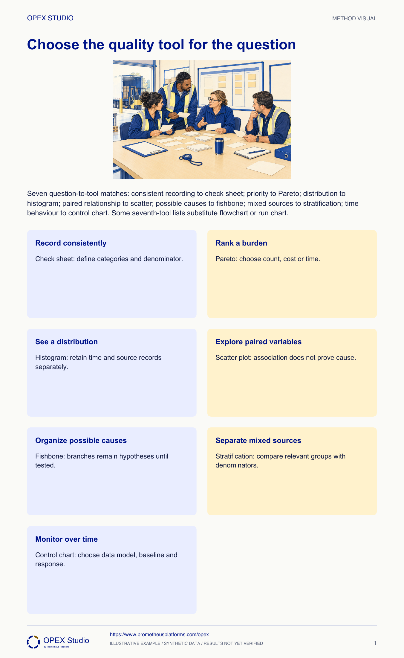
Choosing a tool starts with the decision, not with a favourite diagram. A check sheet collects observations consistently; a Pareto ranks a stated burden; a histogram displays a distribution; and a scatter plot explores paired variables. A control chart adds time and a baseline model. A fishbone organizes possible causes, while stratification separates sources that pooling may hide. These tools can be used together, but each answers a different question. First write the question in plain language. Then choose the smallest useful display and state what further evidence is needed before acting.
Classic seven includes stratification; some lists use flowchart or run chart instead.
The tool selects an evidence view, not a guaranteed conclusion.
Choose the question before the display.
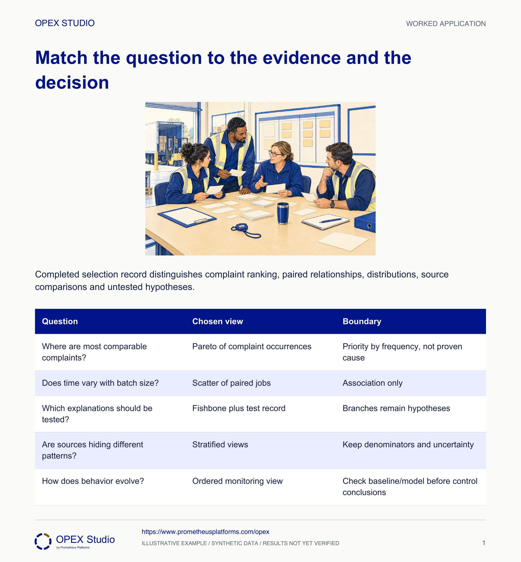
Fictional case: Vale Dispatch has delivery complaints, measured packing times and a list of possible causes. Coordinator Lina is asked to produce a quality chart for the weekly meeting. The manager wants to know where to begin, while a technician wants to know whether packing time changes with batch size. These are different questions; one attractive chart cannot answer both.
Rebuild the Pareto using documented recovery time for every included category, label hours and retain the original frequency chart separately.
Changing the basis can change the rank. Adding hours to occurrence counts would produce an uninterpretable total.
Turn a vague quality concern into an answerable question, select a suitable evidence display, and state what that display cannot establish.
Fictional case: Vale Dispatch has delivery complaints, measured packing times and a list of possible causes. Coordinator Lina is asked to produce a quality chart for the weekly meeting. The manager wants to know where to begin, while a technician wants to know whether packing time changes with batch size. These are different questions; one attractive chart cannot answer both.
Role: Dispatch coordinator and process analyst
Every proposed display has a stated question, an observation unit, a defined window and an honest limit of inference. Raw records retain their original identities.
A draft slide mixes complaints, hours and suggested causes into one descending bar chart. Its title says the biggest bar is the root cause.
| Available evidence | What it can support |
|---|---|
| Complaint log | Category, date and shipment identity; counts can be compared within the same window |
| Packing observations | Paired batch size and packing minutes for each observed job |
| Cause list | Three untested explanations suggested by the team |
| Measurement history | Ordered packing times with operating context; baseline assumptions not yet assessed |
Lina separates “Which complaint category contributes most occurrences this week?” from “Do larger batches tend to take longer?” She records the intended user of each answer.
Why: The question determines the evidence and display. Starting from a preferred graphic invites conclusions that the available records cannot support.
Evidence: Two written questions, each tied to a decision rather than “make a chart”.
She defines one complaint occurrence and checks duplicates against shipment IDs. For the timing question she keeps each batch-size/time pair together instead of sorting the two columns separately.
Why: Comparable counts need a consistent category rule. A paired relationship disappears or becomes fictitious if the observations lose their pairing.
Evidence: Complaint records retain their window; every time has its matching batch size.
She assigns a Pareto chart to complaint frequency and a scatter plot to the paired observations. A check sheet is the next collection method if future categories are inconsistent.
Why: Pareto ranks a chosen burden; scatter explores association. Neither is a root-cause verdict, and neither replaces the record definitions.
Evidence: The chart request identifies tool, input and permissible interpretation.
A histogram can summarize packing-time distribution; stratification can separate routes or product groups; a fishbone can organize competing hypotheses. Time behavior needs ordered data and an appropriate run/control view.
Why: These tools reveal different structures. Mixed sources, timing and causal hypotheses should not be folded into an unexplained “quality score”.
Evidence: A selection record covers all seven roles without claiming that every project must use every tool.
Lina asks the manager to prioritize a category for investigation and asks the analyst to assess the paired data. She removes the root-cause title and records the unresolved checks.
Why: A useful display ends with a defensible decision and the next evidence needed. Restraint about causation is part of using the tool correctly.
Evidence: The meeting assigns evidence collection, not a causal conclusion from a bar height.
| Question | Chosen view | Boundary |
|---|---|---|
| Where are most comparable complaints? | Pareto of complaint occurrences | Priority by frequency, not proven cause |
| Does time vary with batch size? | Scatter of paired jobs | Association only |
| Which explanations should be tested? | Fishbone plus test record | Branches remain hypotheses |
| Are sources hiding different patterns? | Stratified views | Keep denominators and uncertainty |
| How does behavior evolve? | Ordered monitoring view | Check baseline/model before control conclusions |
The manager now asks which complaint type consumes the most recovery hours.
Rebuild the Pareto using documented recovery time for every included category, label hours and retain the original frequency chart separately.
Changing the basis can change the rank. Adding hours to occurrence counts would produce an uninterpretable total.
A revised request names recovery hours and the same declared reporting window.
New fictional case: a clinic has appointment-delay minutes, delay categories and two proposed explanations. The supervisor asks for a distribution, the largest time burden and a way to test explanations.
| Request | Available record |
|---|---|
| Typical spread | Twenty ordered delay measurements |
| Largest burden | Delay category and minutes for each event |
| Explanation | Two staff suggestions; no tests yet |
Use a histogram for distribution while retaining order elsewhere, a Pareto of summed delay minutes for the burden, and a hypothesis/test record informed by a fishbone for explanations.
A histogram does not establish stability; a time Pareto does not prove cause; a fishbone does not verify a branch. A rare long delay can contribute more minutes than many short delays.
| Request | Defensible selection | Required boundary |
|---|---|---|
| Distribution | Histogram of delay minutes | No stability claim |
| Time burden | Pareto of minutes by category | One comparable basis |
| Explanation | Competing hypotheses and tests | Zero causes verified initially |
What decision is hidden inside “make a quality chart”?
Defend a tool, then name what it cannot tell us.
Which unit belongs on each axis or total?
What raw information must survive the display?
Individually write each request as a question before looking at the seven-tool overview.
Owner: Process analyst with the record owner
Record: Question, collection definition, selected display and interpretation note
Review: At the next evidence review
Evidence: A colleague can reproduce the display and distinguish findings from hypotheses
Return to data definition or collection when the requested conclusion exceeds the evidence.
The classic seven include fishbone, check sheet, control chart, histogram, Pareto, scatter and stratification; some lists substitute flowchart or run chart.
Public primary-source summary; underlying paid standards/forms are not reproduced.Read the lessons online or use these PDFs to prepare, practise and review with your team. No sign-in needed.
Case objectives, demonstration plans, debriefs, common mistakes and application checks across all 81 workplace cases and method lessons.
Download Facilitator guide PDF · 166 pages · 65.1 MBPrintable case worksheets, blank observation records and five calculation exercises; answers are separate.
Download Learner workbook PDF · 169 pages · 10.7 MBReasoned sample responses, worked calculations and coaching guidance; fictional examples are clearly labelled.
Download Answer key and coaching notes PDF · 105 pages · 8.5 MBThe native method mechanisms and worked applications for all 68 detailed lessons, in a separate bookmarked portrait reference.
Download Method and application reference PDF · 141 pages · 10.2 MBFive illustrated system chapters: 15 Flare concept maps and 26 original workplace teaching cards, with links to all 81 supporting cases and method lessons.
Download Illustrated systems atlas PDF · 69 pages · 55.8 MBExplore this connected method and its separate application conditions.
Explore the connected method →Explore this connected method and its separate application conditions.
Explore the connected method →Explore this connected method and its separate application conditions.
Explore the connected method →Explore this connected method and its separate application conditions.
Explore the connected method →Explore this connected method and its separate application conditions.
Explore the connected method →Explore this connected method and its separate application conditions.
Explore the connected method →Explore this connected method and its separate application conditions.
Explore the connected method →