Facilitator guide
Case objectives, demonstration plans, debriefs, common mistakes and application checks across all 81 workplace cases and method lessons.
Download Facilitator guide PDF · 166 pages · 65.1 MB OPEXSTUDIO
Classify each inspected unit once as conforming or nonconforming.. Follow the visual, practise a decision, then check your thinking.
Fictional teaching examples and AI-generated illustrations. Proposed changes and goals are not achieved results. Use the written instructions and check local conditions before applying a method.
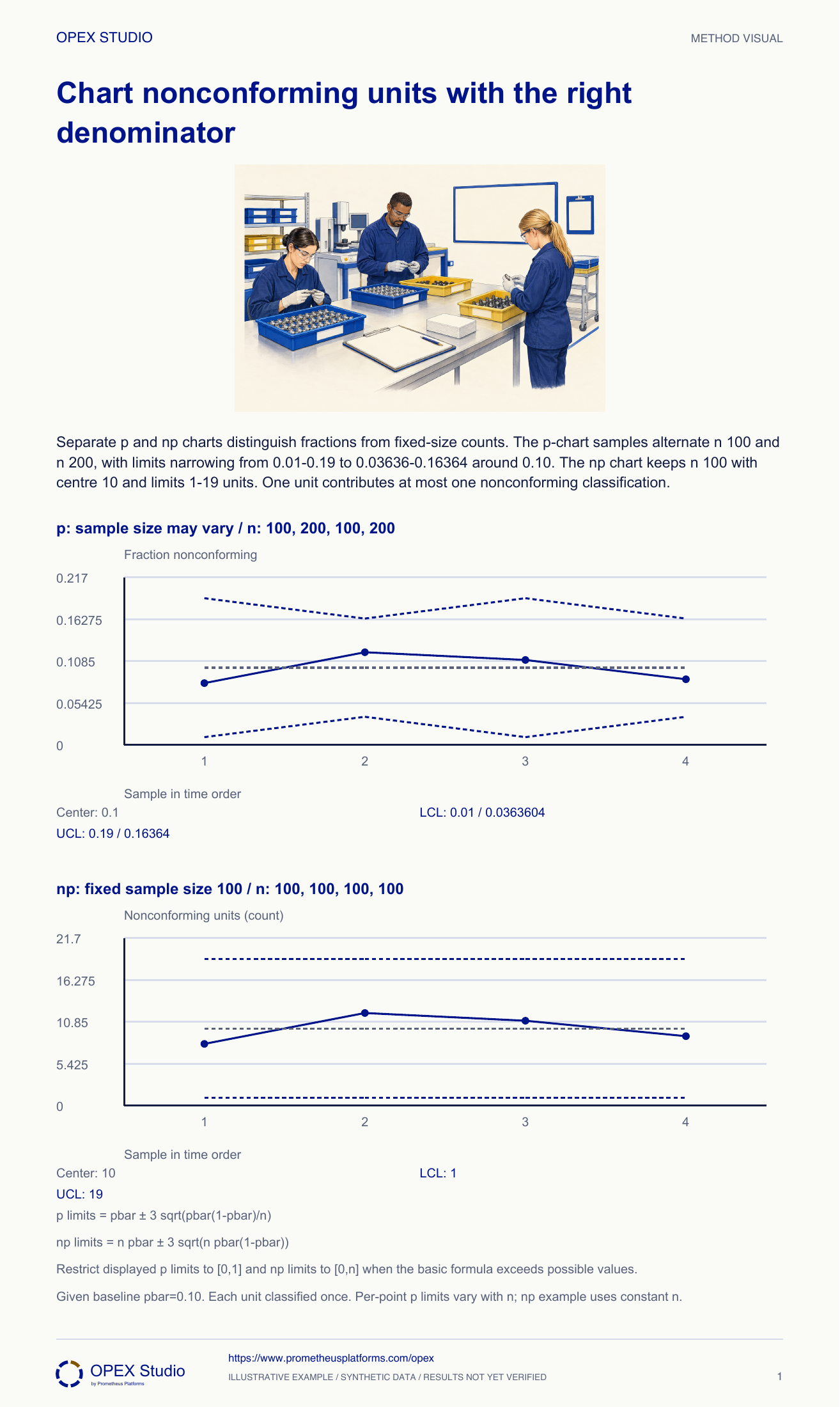
For nonconforming units, every inspected unit contributes at most one failure to the count. A p chart displays the fraction nonconforming and can accommodate different sample sizes with different limits. An np chart displays the count and assumes a constant sample size in this basic form. A larger sample narrows the p-chart limits because it changes the expected sampling variation; it does not change the customer specification. Estimate the baseline from appropriate totals and retain each denominator. The example uses a supplied baseline proportion. Dependence, changing product mix and unsuitable binomial assumptions require investigation rather than blind application of these formulas.
pbar0.10; n100 limits0.01–0.19; n200 limits0.03636–0.16364.
Fixed n100 gives np centre10 and limits1–19.
Basic binomial limits; retain all sample sizes.
Fictional case: an inspection desk classifies each item once as conforming or nonconforming. A supplied historical fraction is .10. The core p example uses sample sizes 100,200,100,200 and counts 8,24,11,17; the separate np example always inspects 100 and records 8,12,11,9. Analyst Pia explains why limits must reflect the observation design.
Retain 20/200=.10 and handle the sampling-design change through the chart owner; do not compare 20 directly with the old fixed-n100 upper limit 19.
The change in denominator alone can explain the count increase. The original chart was designed for fixed n.
Keep nonconforming-unit counts linked to sample size, calculate the appropriate fraction or fixed-size count limits, and interpret a changed denominator.
Fictional case: an inspection desk classifies each item once as conforming or nonconforming. A supplied historical fraction is .10. The core p example uses sample sizes 100,200,100,200 and counts 8,24,11,17; the separate np example always inspects 100 and records 8,12,11,9. Analyst Pia explains why limits must reflect the observation design.
Role: Quality analyst and inspection owner
Every sample records its actual inspected amount; one item contributes at most one nonconforming classification; model and baseline are suitable for the declared process.
A supervisor compares 24 failed items in 200 with 12 in 100 and declares the larger sample twice as bad. Both are 12%.
| Sample | Inspected / nonconforming | Fraction |
|---|---|---|
| 1 | 100 /8 | .08 |
| 2 | 200 /24 | .12 |
| 3 | 100 /11 | .11 |
| 4 | 200 /17 | .085 |
Pia checks that an item with several faults is still classified once in this unit-count record. She retains fault-category details separately if needed.
Why: A p or np chart describes affected units, not the number of faults within them. Mixing those numerators would break the interpretation.
Evidence: Each count is bounded by its inspected sample size.
She divides each sample count by its actual n and retains n beside the plotted point. Sample 2 is 24/200=.12, not 24/100.
Why: Different sample sizes can produce different counts with the same fraction. The denominator also determines the expected sampling variation.
Evidence: The sequence is .08,.12,.11,.085 with its four actual sample sizes.
Using .10 ±3√(.10×.90/n), n100 gives .01–.19; n200 gives approximately .03636–.16364. The center stays .10.
Why: The larger sample has narrower fraction limits under this model. Reusing fixed limits for all denominators would discard relevant information.
Evidence: Each point receives limits matching its own n; limits remain within possible fraction values.
For the separate fixed-n100 illustration, np center is 10 and limits are 1–19 nonconforming units. Pia labels counts and does not mix this axis with fractions.
Why: A count view is interpretable when the inspected amount is fixed. A p view can also be used with fixed n if it is clearly labelled.
Evidence: The np sequence 8,12,11,9 uses n100 throughout.
Pia documents any signal against the supplied baseline and checks measurement, sampling and process context. Product containment and release follow the applicable quality procedure.
Why: A point within statistical limits is not proof that the defect level is acceptable. A signal identifies changed behavior worth responding to, not its cause.
Evidence: The record separates chart evidence, product decisions and investigation ownership.
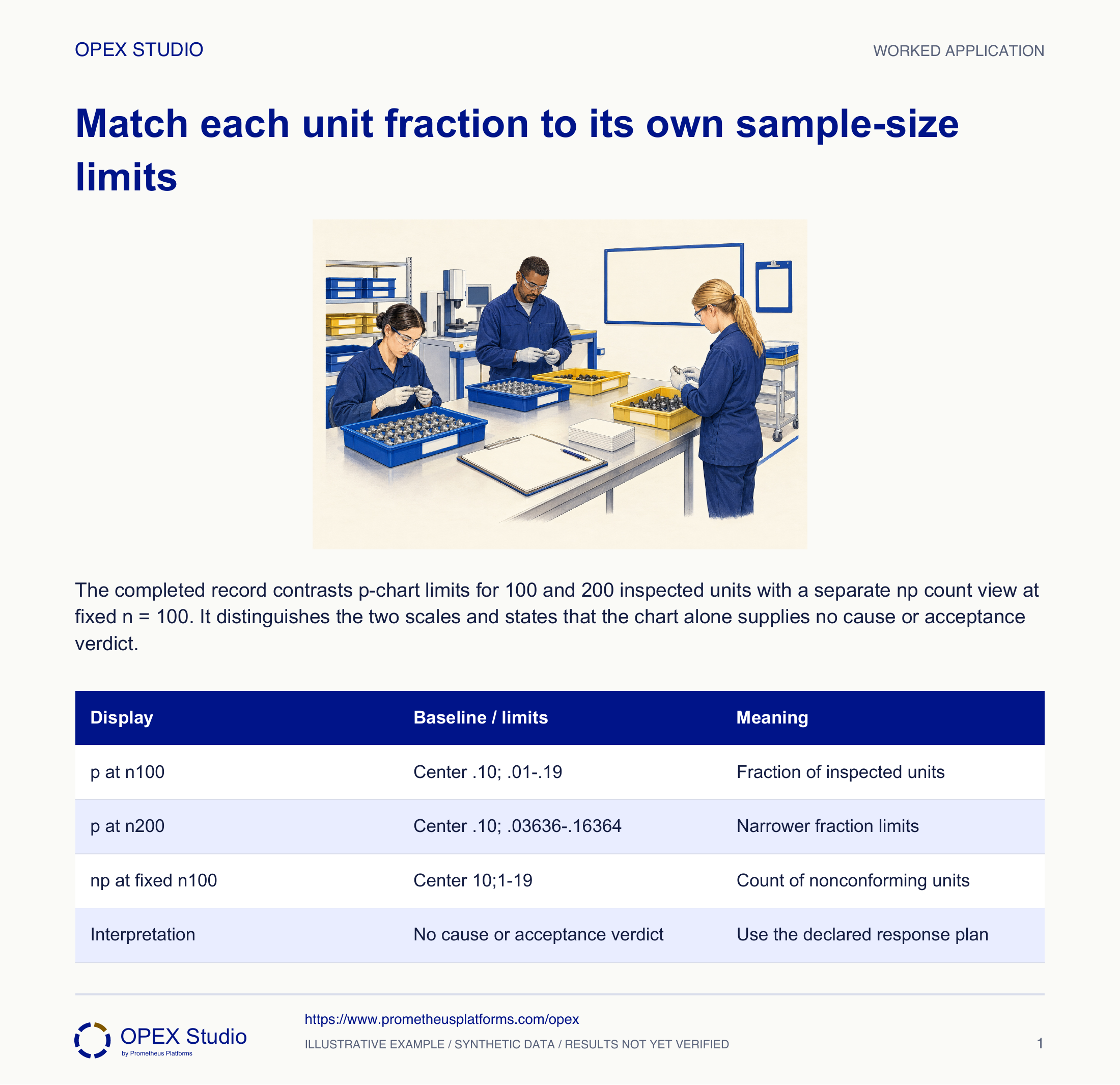
| Display | Baseline / limits | Meaning |
|---|---|---|
| p at n100 | Center .10; .01–.19 | Fraction of inspected units |
| p at n200 | Center .10; .03636–.16364 | Narrower fraction limits |
| np at fixed n100 | Center 10;1–19 | Count of nonconforming units |
| Interpretation | No cause or acceptance verdict | Use the declared response plan |
A busy shift inspects 200 instead of 100 and enters 20 in the count chart.
Retain 20/200=.10 and handle the sampling-design change through the chart owner; do not compare 20 directly with the old fixed-n100 upper limit 19.
The change in denominator alone can explain the count increase. The original chart was designed for fixed n.
The observation is preserved with n200 and a documented display/design decision.
New observation under the supplied pbar=.10 baseline:36 nonconforming units among 200 inspected. A colleague proposes dividing by 100 because that was yesterday’s amount.
| Given | Value |
|---|---|
| Nonconforming | 36 |
| Inspected | 200 |
| Historical pbar | .10 |
36/200=.18. For n200, the supplied-baseline limits are approximately .03636–.16364; .18 exceeds the upper limit.
Report an upward signal and follow the approved response. Dividing by 100 invents a denominator; the chart itself does not decide the disposition of particular units.
| Calculation | Result | Decision |
|---|---|---|
| 36/200 | .18 | 18% observed |
| Upper limit | .16364 | .18 is above UCL |
| Product status | Separate applicable criteria | No automatic release or scrap |
Can one item contribute three here?
Why do fraction limits narrow?
What denominator and limit apply?
Why does a chart not authorize product release?
Write n next to each numerator before choosing a plotting scale.
Owner: SPC and inspection owners
Record: Count, denominator, baseline and sample-specific response record
Review: At each sampling interval and whenever sampling changes
Evidence: One classification per unit, correct n and verified response
Resolve denominator/model changes before applying a fixed-n interpretation.
The binomial model underlies fraction-nonconforming charts; limits depend on the sample denominator.
Public primary-source summary; underlying paid standards/forms are not reproduced.Read the lessons online or use these PDFs to prepare, practise and review with your team. No sign-in needed.
Case objectives, demonstration plans, debriefs, common mistakes and application checks across all 81 workplace cases and method lessons.
Download Facilitator guide PDF · 166 pages · 65.1 MBPrintable case worksheets, blank observation records and five calculation exercises; answers are separate.
Download Learner workbook PDF · 169 pages · 10.7 MBReasoned sample responses, worked calculations and coaching guidance; fictional examples are clearly labelled.
Download Answer key and coaching notes PDF · 105 pages · 8.5 MBThe native method mechanisms and worked applications for all 68 detailed lessons, in a separate bookmarked portrait reference.
Download Method and application reference PDF · 141 pages · 10.2 MBFive illustrated system chapters: 15 Flare concept maps and 26 original workplace teaching cards, with links to all 81 supporting cases and method lessons.
Download Illustrated systems atlas PDF · 69 pages · 55.8 MBExplore this connected method and its separate application conditions.
Explore the connected method →Explore this connected method and its separate application conditions.
Explore the connected method →Explore this connected method and its separate application conditions.
Explore the connected method →